Journal
Visualizing tracked time in the schedule timeline
These past couple weeks, I’ve been laser-focused on an exciting new addition to Cushion’s schedule timeline—visualizing tracked time. Despite wanting to hold off on entirely new features in the new schedule timeline until I reached feature parity with the existing timeline, I simply couldn’t help myself. I’m way too eager to not only use this new feature, but also to build it.
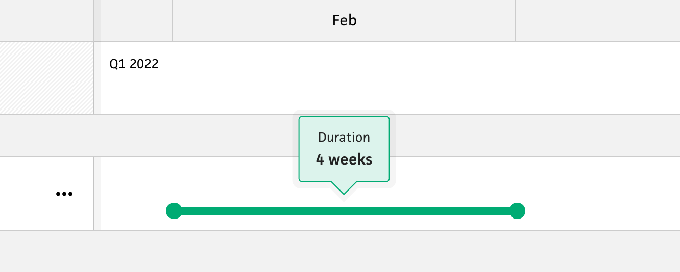
Existing duration of a project
Up until now, the schedule timeline would visualize a project using the start and finish dates—drawing a dark line to represent the time spent on the project. Unless you’re working on the project every day, however, this line isn’t entirely accurate because there’s no indication of downtime within a project… until now. By visualizing tracked timeline in the schedule timeline, I’ve been able to achieve a crystal clear picture of when you spend time on a project as well as the amount of effort you put into the project. This feature alone instantly makes the timeline 10x more valuable while catapulting my excitement for where it might lead Cushion.
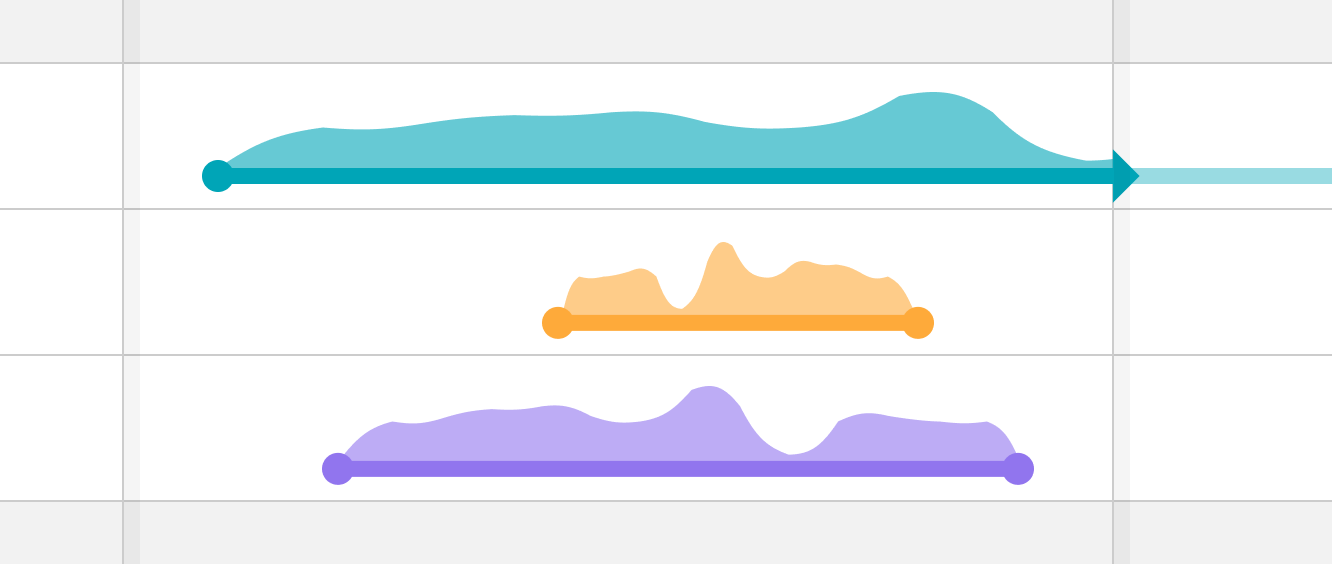
Original design for tracked time
When I first designed the visual for tracked time in the timeline, I imagined a smooth bezier path that would simply add a 2nd dimension to projects. This felt like a good direction for most of the time I was in the design phase, so the bezier remained the plan. When I was ready to finally code it, I decided I’d first create the SVG path using hard points (since it’s an easy first step to simply map the points). Then, I’d follow this up by adding the bezier.
Tracked time with hard points
As soon as I visualized the tracked time with hard points, however, I fell in love with the jagged look. Since tracked time is more matter-of-fact than estimated time, it makes more sense to visualize it with hard points. I can then save the smooth bezier path for estimated time, so the distinction between tracked time and estimated time is clearer. As an added bonus, the hard points look a bit like the mountain landscapes on Cushion’s marketing website, so it’s a familiar connection beyond the app.
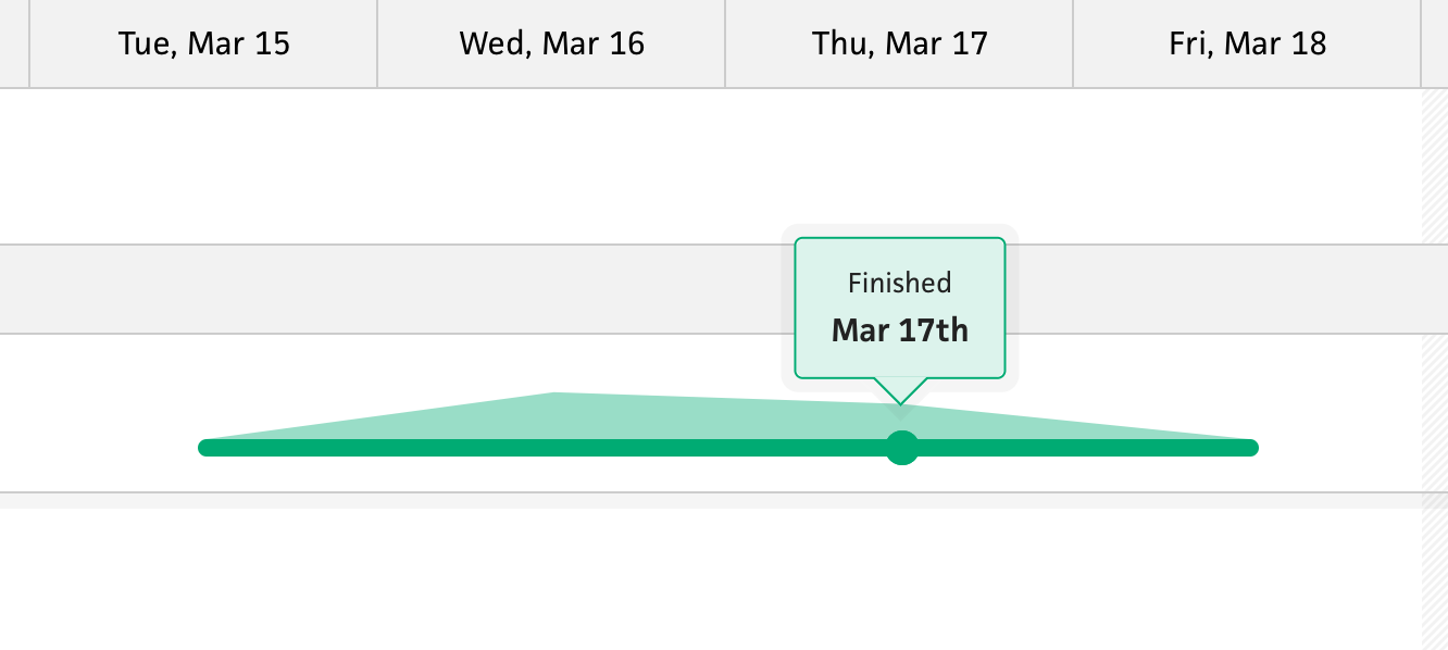
Inaccurate finish from wrapping zero-based y points
In order to make the tracked time start and end with a zero-based y points, I needed to “wrap” the tracked points with additional points that simply extend the path by a day on each side and zero out the y. This looked great, and seemed to work as expected—until I saw a project with a specific finish date.
Up until now, all the dates within the timeline have been centered, so if a single day spans 100px in the timeline, any start/finish/cancel date would be placed at 50px. This made sense for the timeline so far. Once I added tracked time, however, those zeroed y points needed to wrap the span of tracked time. This unfortunately made the project look like it started a day early or finished a day later. When comparing the dots and the paths, it looked broken. This was not acceptable.
I spent an hour trying a few different options to get around the issue until I landed on a solution—alignment within a day. If I truly consider the timeline to be mapped time-to-pixel, then each day would actually be 12:01am to 11:59pm, with 12:01am being ~0px and 11:59pm being ~100px (as an example). That’s pretty granular for my case, but from a high level, I could think of these dates as having a start, middle, and end rather than a single-value. Then, I could use those alignments when plotting points, depending on the start/middle/end of the day.
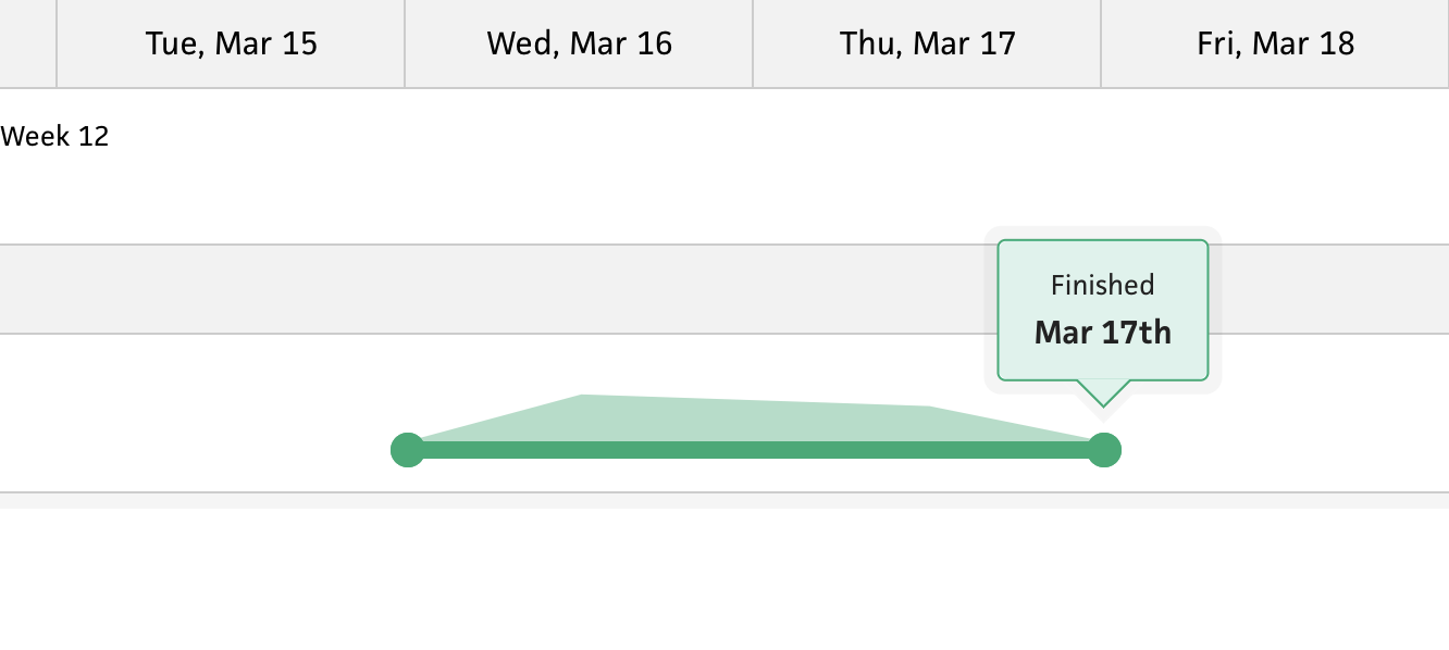
Aligning the finished date to the end of the day
In the case of start and finish dates, I would plot a start date at the beginning of the day, then plot the finish date at the end of the day. This would more accurately reflect that a 1-day project is the entire course of the day, while also fixing the issue with drawing the path for tracked time. Just like the start/finish dates, the path would start at the beginning of the day and finish at the end of day. The point that measures the tracked time would then be centered within the date—clearly visualizing the tracked time for a single day.
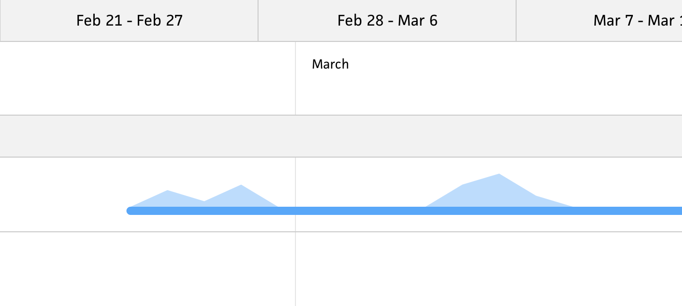
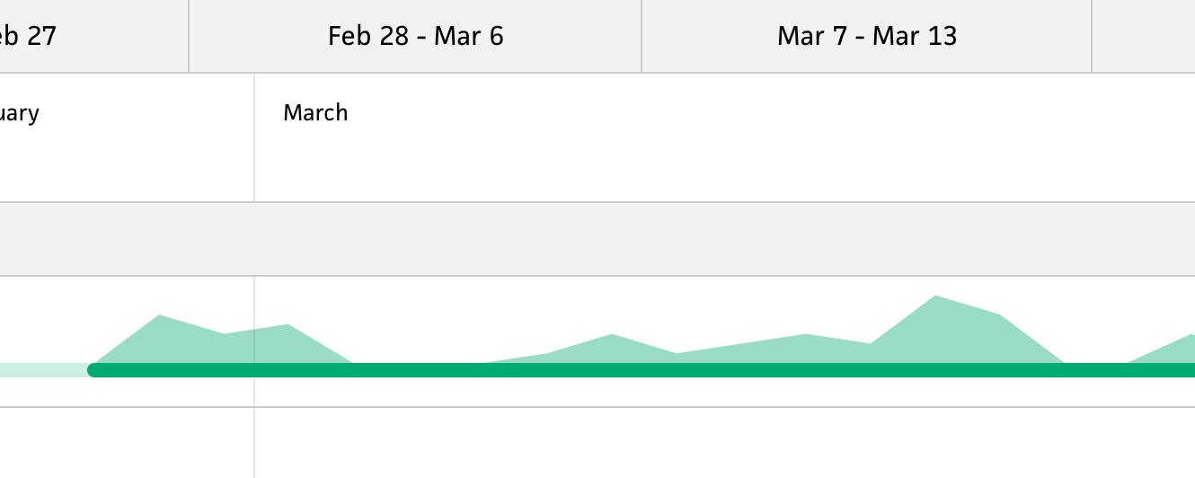
Downtime only represented by an absence of tracked time
At this point, I had figured out the logic for accurately drawing the path, but there was one last improvement that I wanted to sneak into this initial iteration. If I truly needed to know when there was downtime within a project, I couldn’t have a solid line for the entire duration of the project—this wasn’t enough for folks to register at a glance. Instead, I needed an additional indicator to make it obvious to the user.
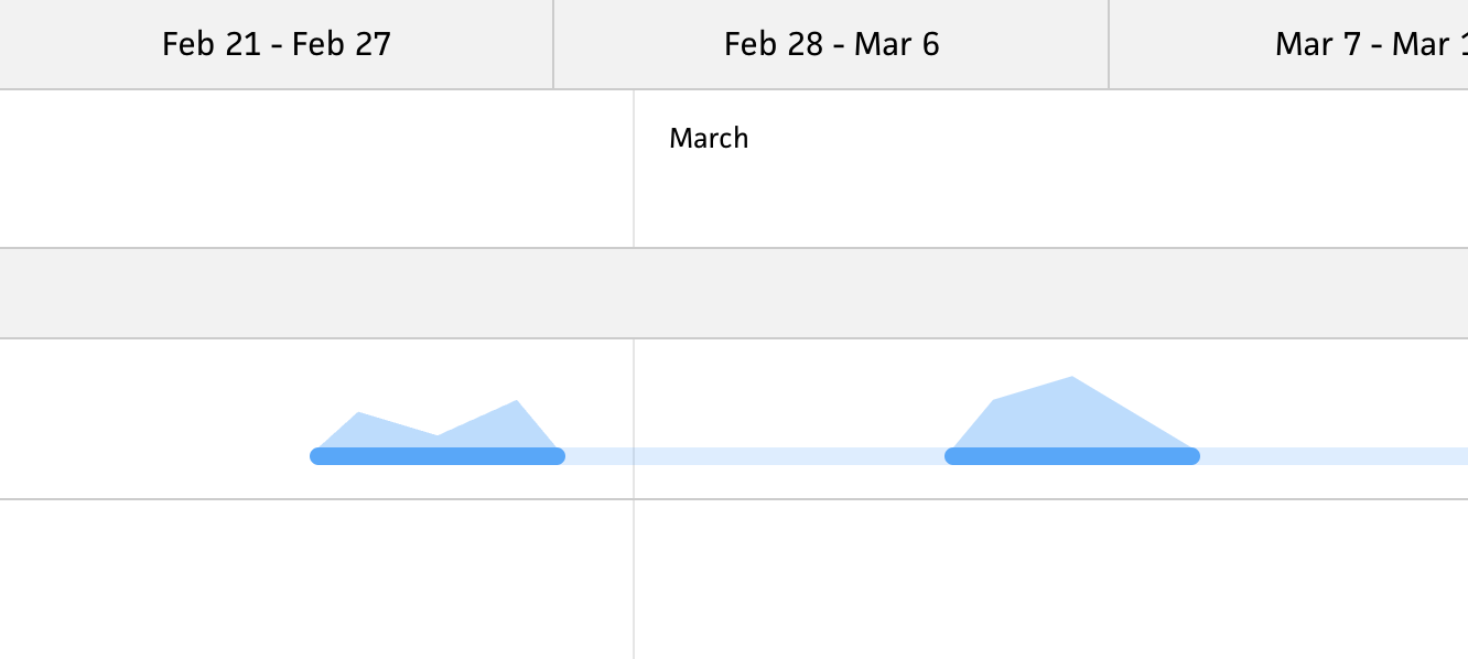
Clearer downtime by separating spans of tracked time
I decided to add logic that splits the path into multiple paths when there’s more than week-long gap between entries. For the durations where there is tracked time, I include the solid line, but for the spans without tracked time, I use a 20% opacity line that continues throughout the entire duration of the project. This line glues the entire project together while clearly pointing out the gaps where there was downtime.
This is a good stopping point—both for this post and for the initial work on this feature before I launch it. I couldn’t wait to write about this, as it’s a prime example of whittling a feature into its best form (so far). There’s still a ways to go, but I absolutely love when everything starts to click naturally. From here, I’ll get feedback from beta users and see what they think. I really hope they’re as excited about it as I am!