Journal
Sticky line item totals
In the previous post, I wrote about possibly the tiniest UX detail in Cushion’s new system—the overflow shadow. I intended to include what I’m writing about today, but then figured that this topic deserves its own post—even if it’s short and sweet.
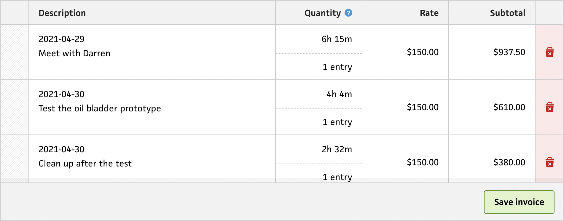
I stumbled upon the idea while implementing the import entries modal. I would test the flow by importing a dozen or so entries, which would always result in more line items than the form could show within the window. This overflow would push the line item totals below the fold, so the user would need to scroll in order to see them.
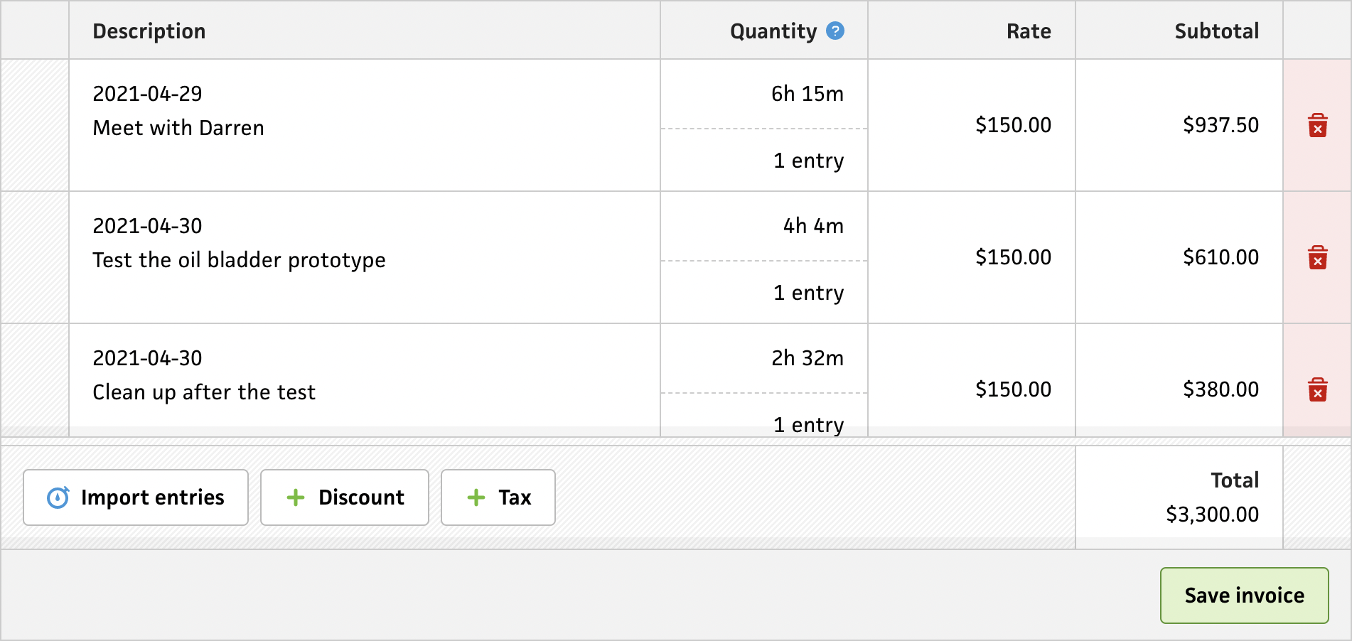
Since I was recently focusing on sticky headers and overflow shadows, I wondered if sticky line item totals would resolve this issue. I applied a sticky bottom to the line item totals, and immediately noticed a difference. Not only can I clearly see the line item totals, but I can also easily access the line item buttons, like “Import entries”, whenever the line items are in view. Both of these realizations made it a no-brainer.
Along with implementing the sticky bottom, I applied the same overflow shadow to the line item totals, or rather the FormSubfooter component, which could now be reused across other forms. If the subfooter is ever stuck, its shadow appears to indicate more content below the fold. As soon as the user scrolls past the subfooter, its shadow hides and the sticky behavior releases the subfooter to continue scrolling with the rest of the line items. This transition makes me weak in the knees every time.
As I’ve mentioned in the past, these little UX tweaks give me so much life. I feel like they make a world of difference, even if they’re not immediately obvious to the user. It’s another level of craft that reiterates to the user that the person behind the software truly cares about every little detail. And it’s true!