Journal
Rethinking the pricing page
Over break, I started redesigning the new pricing page for Cushion. This has been on my to-do list for years, but got bumped to the top with all my recent work to migrate subscription management to Stripe’s Billing customer portal. I’ve already expressed my lack of enthusiasm for designing pricing pages on Twitter, but I was able to make it a fun experience by sneaking in little UX details here and there.

Cushion’s pricing page (2018)
The current pricing page design doubles down on the approach of a long checklist of features comparing the plans. I see these everywhere, and they’re useful, but the longer I lived with the checklist on my own pricing page, the more I hated it. In order to build a checklist, you need items to check, so that means needing to restructure the plans.
In all honesty, I felt like I was scraping the bottom of the barrel to distinguish the Pro plan (the one I want folks to sign up for) from the Starter plan (the one I want folks to upgrade from). Since I built most of Cushion’s features simply because I wanted them to exist, they weren’t exactly easy to divvy up. This actually felt wrong, and I’ve been living with this uncomfortable feeling ever since Cushion has had this comparison table. Looking back at the old pricing page designs (Cushion has had several), I started picking from them the parts that I like.
Cushion’s pricing page (2015)
First and foremost, I appreciate the simplicity. Like many other pricing pages, the title says “Simple pricing”, and it actually was! Cushion had a single plan for years, which meant the pricing page was a decision between monthly and yearly. As a user and the one managing the app, I actually love this simplicity, but as I build more features, the value of the app goes up. Increasing the price means raising the entry-level bar, so you can either stick with the single plan and hope folks will see the value, or you need to add an entry-level plan as a stepping stone.
Cushion’s pricing page (2017)
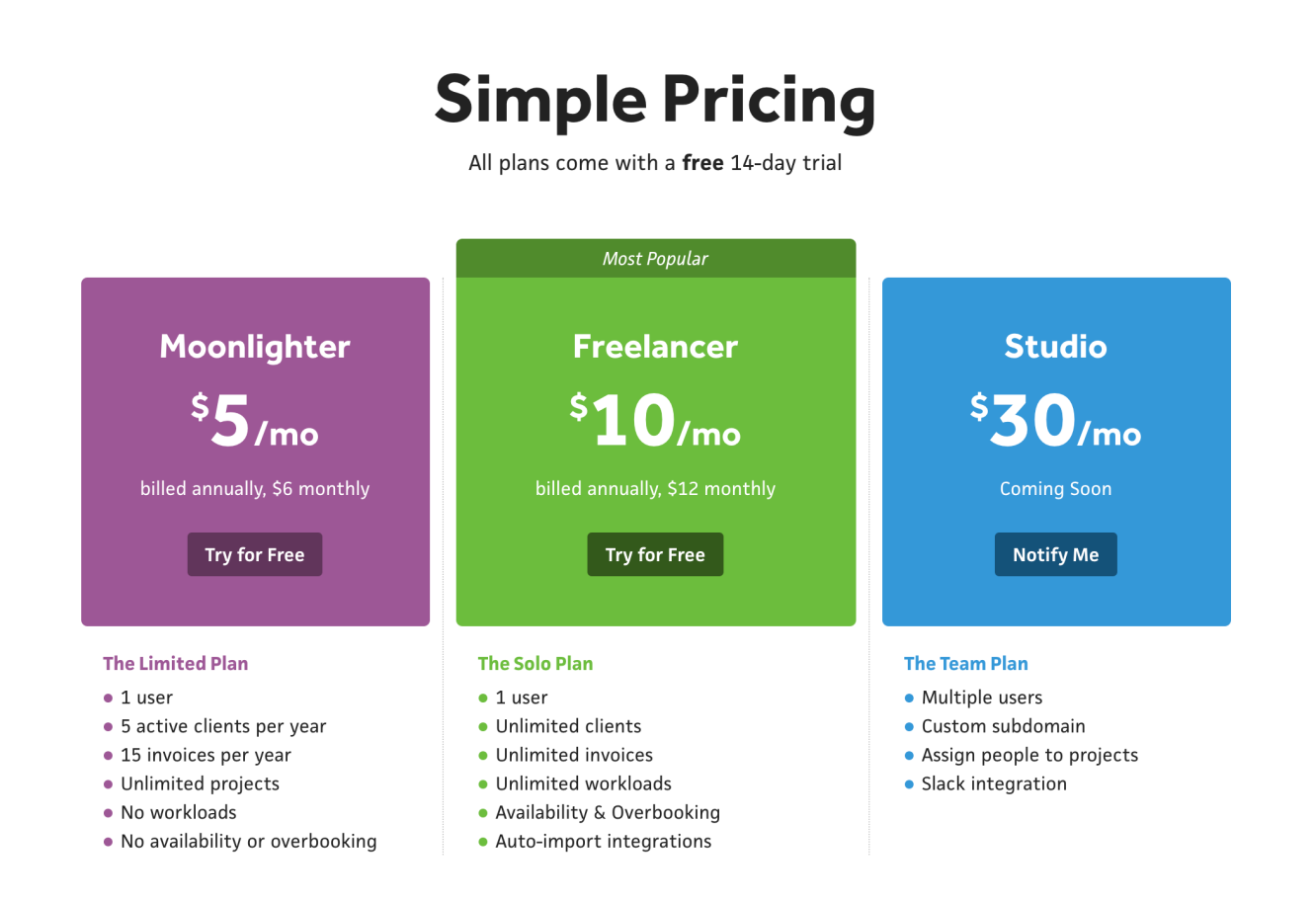
My first attempt at multiple plans resulted in the “Moonlighter” plan and the “Freelancer” plan. The idea was that part-time freelancers would go for the Moonlighter plan, which had limits on clients and invoices. If they ended up going full-time freelance, they could upgrade to the Freelancer plan. As for existing full-time freelancers, they’d obviously go for the Freelancer plan, and that would be that.
While the limits did work to encourage a good portion of folks to upgrade, I realized that the number of clients and invoices has nothing to do with a person’s position in the freelance world. Looking back at my own freelancing, I only had a few clients each year and definitely stayed under the invoice limit, so technically, I would’ve fit in the Moonlighter plan. But, there’s also the reverse end of the spectrum where a freelancer could be reaching the limit in a single month with quick low-paying gigs. At the end of the day, I didn’t feel good about imposing number-based limits.
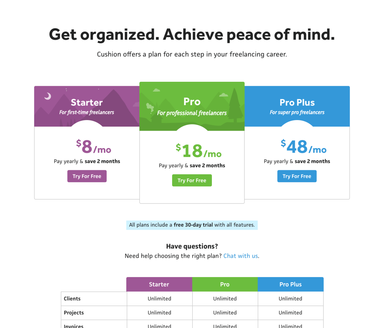
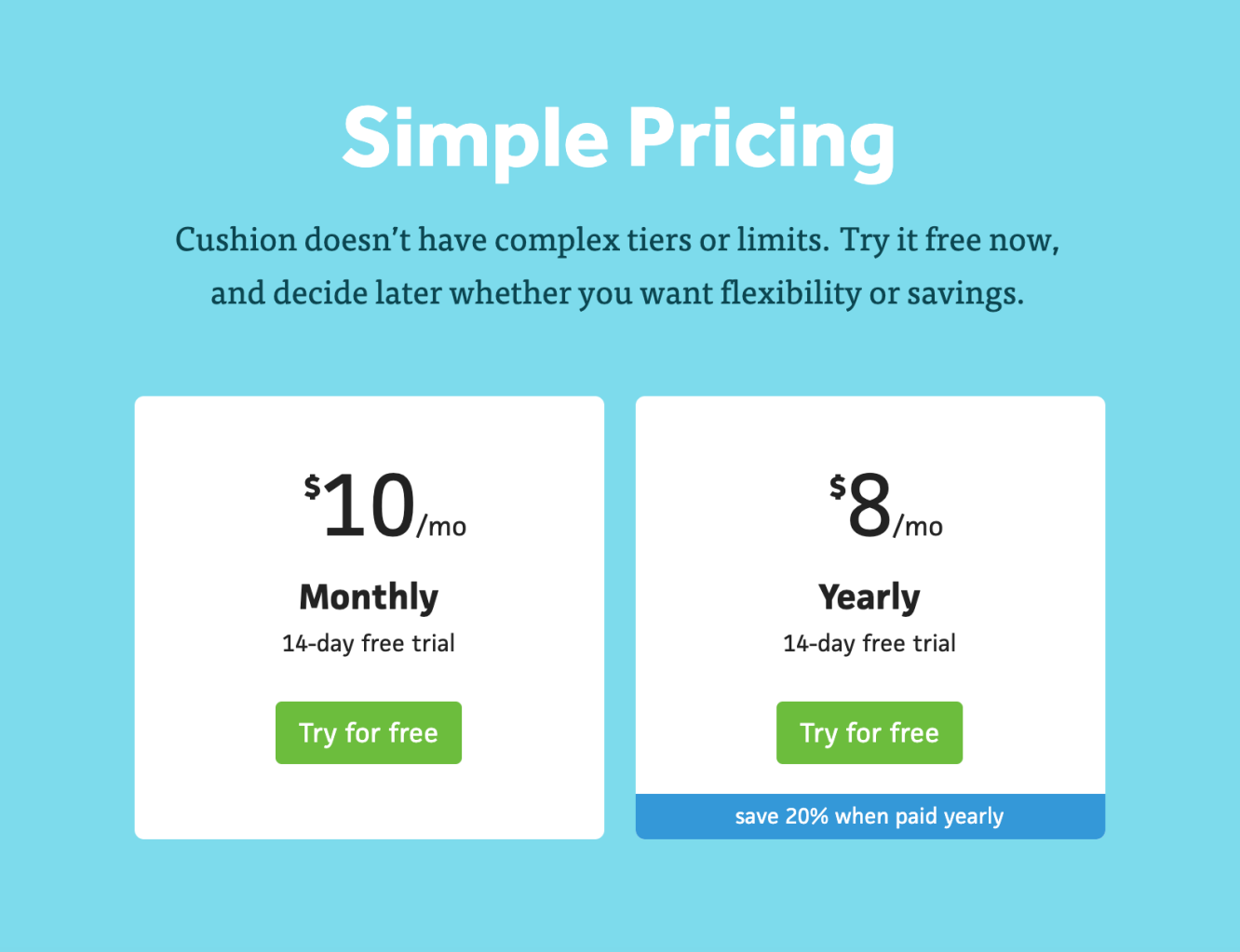
Cushion’s pricing page (2018)
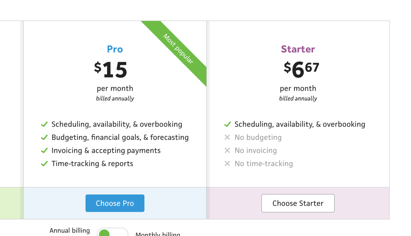
This led me to the current plans with the long comparison table. While certain features do encourage folks to upgrade, I still think it’s a stretch to divvy up these features on such a granular level. From the new onboarding, I’ve learned that everyone’s feature-interest is all over the place. Some want scheduling and budgeting, others want time-tracking and invoicing, and the rest want everything. I know this is inevitable for any app, but it still tugs at the part of me that thinks Cushion does too much. On the other hand, when I was freelancing, I used every aspect of the app, so it’s still justified.
The most interesting part I realized about feature-interest came when I grouped it by plan. Looking at the data as a single bucket didn’t give me much, but separating the plans between “high-value” (Pro) and “low-value” (Starter) made it much clearer. On average, people who end up subscribing to the low-value plan are most interested in scheduling, with invoicing and time-tracking at the way bottom. Those who go for the high-value plan overwhelmingly prioritize invoicing and time-tracking, then scheduling. This gives me much more guidance around structuring the plans, and pinpoints why it doesn’t feel great divvying up detailed “Starter” and “Pro” features for Cushion. Separating plans by low-level features assumes a constant: that users utilize every aspect of the app across the Starter and Pro plans. This definitely isn’t true.
Instead of divvying up the small features, I’d focus on the big features. If the overwhelming majority of people who sign up for Cushion are interested in scheduling, let’s make that the “Starter” feature. Then, considering the average “Pro” user needs invoicing and time-tracking more than the “Starter” user, all the more reason to make those the “Pro” features. Rather than the long checklist of features where probably only a few apply to certain people (and the rest cause confusion from its complexity), I could show the “Starter” plan with ”Scheduling” and the “Pro” plan with “Scheduling, Budgeting, Invoicing, Time-Tracking”. That leaves no room for confusion, creates a much more compelling stepping stone to upgrade from, and follows through with the page’s title saying “Simple pricing”.
This is a solid plan, but every pricing page has three plans—it’s kind of a rule. Typically, this is where an app can include a “Team” plan or an “Enterprise” plan with an obligatory “contact us” button because biz people love to hop on a call. For Cushion, teams has always been in the back of my mind, but I also think it’s a slippery slope towards neglecting the solo freelancer. We actually beta tested “collaboration” features a few years back where users could share certain projects with other freelancers, but it made the app way too complex. I’d actually like to revisit the concept of teams, but not in the open-ended approach. I’ll explain.
Along with learning about feature interest in the new onboarding flow, I also learned about everyone’s “size”, which currently lists “Freelancer”, “Duo”, “Team”, and “Agency”. I definitely don’t want to support the agency scale, so that one’s there simply for curiosity, but the other three help me figure out where Cushion leans. Not surprising, “Freelancer” takes the cake with 3/4 of users. The runner up, however, is “Duo”, which is what I assumed. Cushion currently doesn’t have support for multiple users, but plenty of two-person studios still use it because they can easily share a login, or have one person manage the account. The more people you add to this equation, the more unreasonable it becomes.
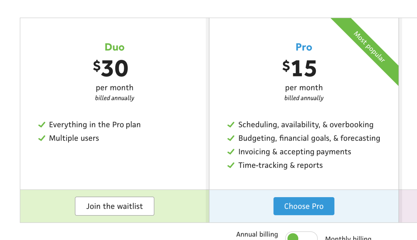
I think the 2-3 person team is the sweet spot. They might be a couple freelancers partnering up or frequent collaborators who work really well together. They’re still close enough to freelancing that they still work like freelancers; they’re not big enough to have one person managing everyone else’s time; and, they still keep Cushion focused on the small scale, which has been my focus all along. A team plan focused on duos and trios could give me that 3rd plan to balance the page along with a longterm plan for the future. Instead of a “Subscribe” button, I could include a “Join the waitlist“ button to start collecting interested teams to follow up with.
This is the current plan, which adds a lot more work to my plate than simply redesigning the pricing page, but that’s okay. I’d much rather rethink the structure now and maintain forward progress, than waste time shoehorning in the existing plans.