Journal
Redesigning the invoice page for SCA with Stripe Elements
I’m making good progress on the new pricing page and at a point where I’m ready to wire it up to Stripe Checkout for creating subscriptions, but I’ve decided to pause for a minute to focus on the invoice page. The SCA deadline is quickly approaching, and because Cushion accepts invoice payments on users’ behalf using the legacy Stripe Checkout, this integration is at risk, too. If I had to decide between the occasional subscription charge failing because SCA isn’t in place or a user’s client seeing an error when paying a large invoice, I’d definitely do whatever I can to make sure the client doesn’t have that experience—and that’s what I’m doing.
The invoice page actually lives on its own server because it’s a Nuxt.js app with an Express backend. The main reason I went this route is to could get server-side rendering to handle downloading invoices as a PDF using Puppeteer, a headless Chrome Node.js API. This way, I only need to build the invoice template components once, and I can share them between the invoice page, Cushion’s invoice preview within the app, and the PDF. I don’t love that this code lives in its own repo, so I did spent a few cycles seeing if I could merge it into the main codebase and spin up its web server alongside the main one in the Heroku app, but that didn’t pan out. Apparently, Heroku only supports one web server per Heroku app, and I’m not looking to find a clever way around it.
With that experiment behind me, I behaved like a good developer and started by updating all of the invoice page’s dependencies. Since the page is heavily tested, this was simply a matter of upgrading them one by one and running the tests each time. Surprisingly, only a couple of them caused issues. When I upgraded Knex, it complained about a missing tap method because Knex now uses native Promises instead of Bluebird. Then, Hashids threw an error because Jest balked at export, so I had to import it as hashids/cjs. Once I had those hiccups behind me, I was able to move forward.
The next step, however, is a shift from code to design—this is where the post actually starts. Since the user’s client is the user on this page, and they have no context of Cushion, I’d rather not redirect them to the new Stripe Checkout, which might cause confusion. Keeping the client on the invoice page and letting them pay right there is a much nicer experience. This UX decision means I need to design a custom card payment flow. (Remember what I said a few posts ago about tasks inevitably snowballing?)
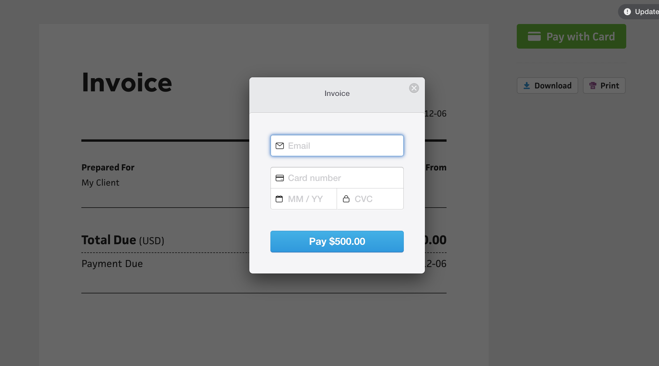
The legacy Stripe Checkout design definitely dates itself, but it’s a workhorse—it’s gotten the job done since I started charging for Cushion in 2014, which is really impressive. I don’t love the shadow, gradient button, or transparent black background, so I can replace those with a flat shadow, a flat button, and a transparent blue background—much closer to Cushion’s design.
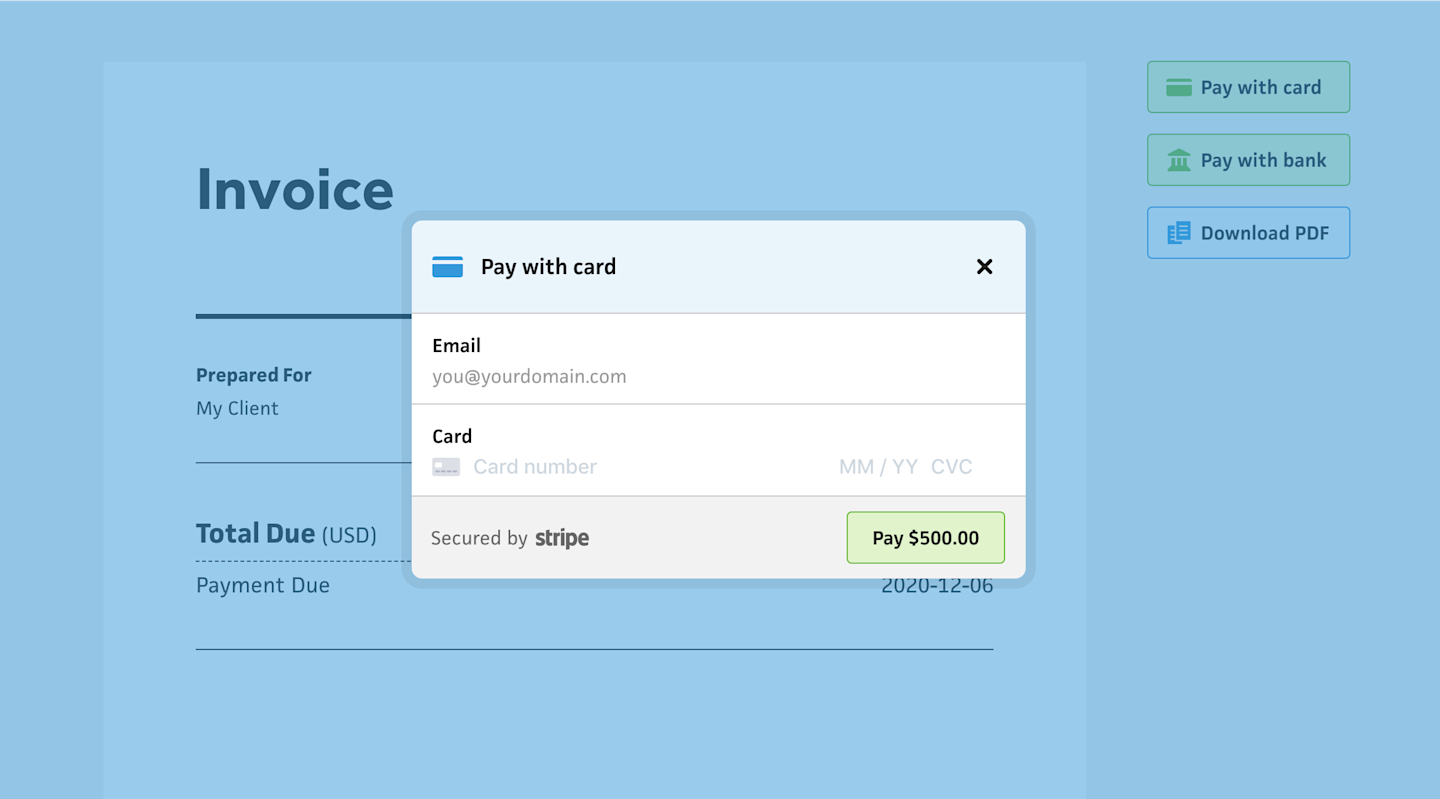
I’m also taking this opportunity to make the form feel friendlier by balancing the title with a card icon. At the same time, I want the form to feel safe, so I mention that it’s “Secured by Stripe” in the footer. While I do get to use Cushion’s new form field design system, I’ll need to fit retrofit the card inputs into the card field. Those will actually be generated by Stripe Elements, which provides a slick, responsive flow between fields, while also taking care of validation. By using Stripe Elements, SCA is taken care of by Stripe, which is the entire reason I’m doing all this work. (“…It’ll be worth it…”, I mumble to myself)
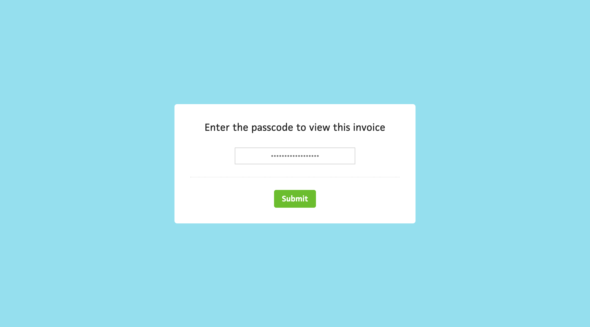
I tend to add more work for myself in the name of it being the right thing to do, so while I’m redesigning the card payment modal, I might as well redesign the invoice page’s passcode modal, too. This modal lets users passcode-protect their invoice while also providing a short URL with the (completely worth it) domain name I acquired a few years back—in.vc. The current design is as basic as you can get, and does reflect the existing Cushion design, but it’ll look so much better with the new design system.
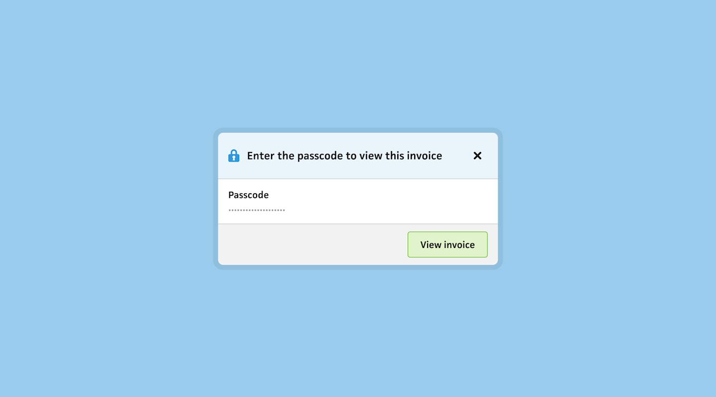
And it does! Again, I include some personality with a title icon, and all the other elements simply make the form feel more legit. Comparing the two, I can definitely see how my design sense has matured over the years. The softer colors ease you into the form rather than hitting you over the head with stark white and a hard green button. The new design system also focuses much more on accessibility—no more white text on colored fills or light grey text on white. #222 all the way.
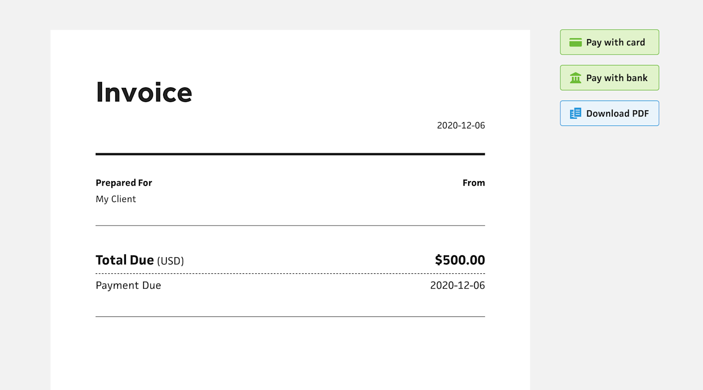
The last part I updated is the invoice buttons. Since the new modal buttons use the new design system, I couldn’t possibly let these buttons remain in the old style. Like the passcode modal, they really help soften the page rather than feeling too heavy with a solid fill. The fact that they work here as well as within the app is reassuring that I’m designing in the right direction.