Journal
Redesigning the flow for importing tracked time into invoices
For the past week (or more!), I’ve been working on Cushion’s flow for importing tracked time into invoices. This is a more involved part of my current big rock, which is rebuilding the invoicing form from the ground up. As I’ve mentioned in previous posts, this form is one of the oldest UIs in Cushion. Because of that, it has a lot of… “charm”—others might call this “messy code”. On the bright side, every improvement I make is a significant improvement—both in the codebase and in the user experience. And, if we’re focusing on the UX, this particular flow has the most room for improvement.
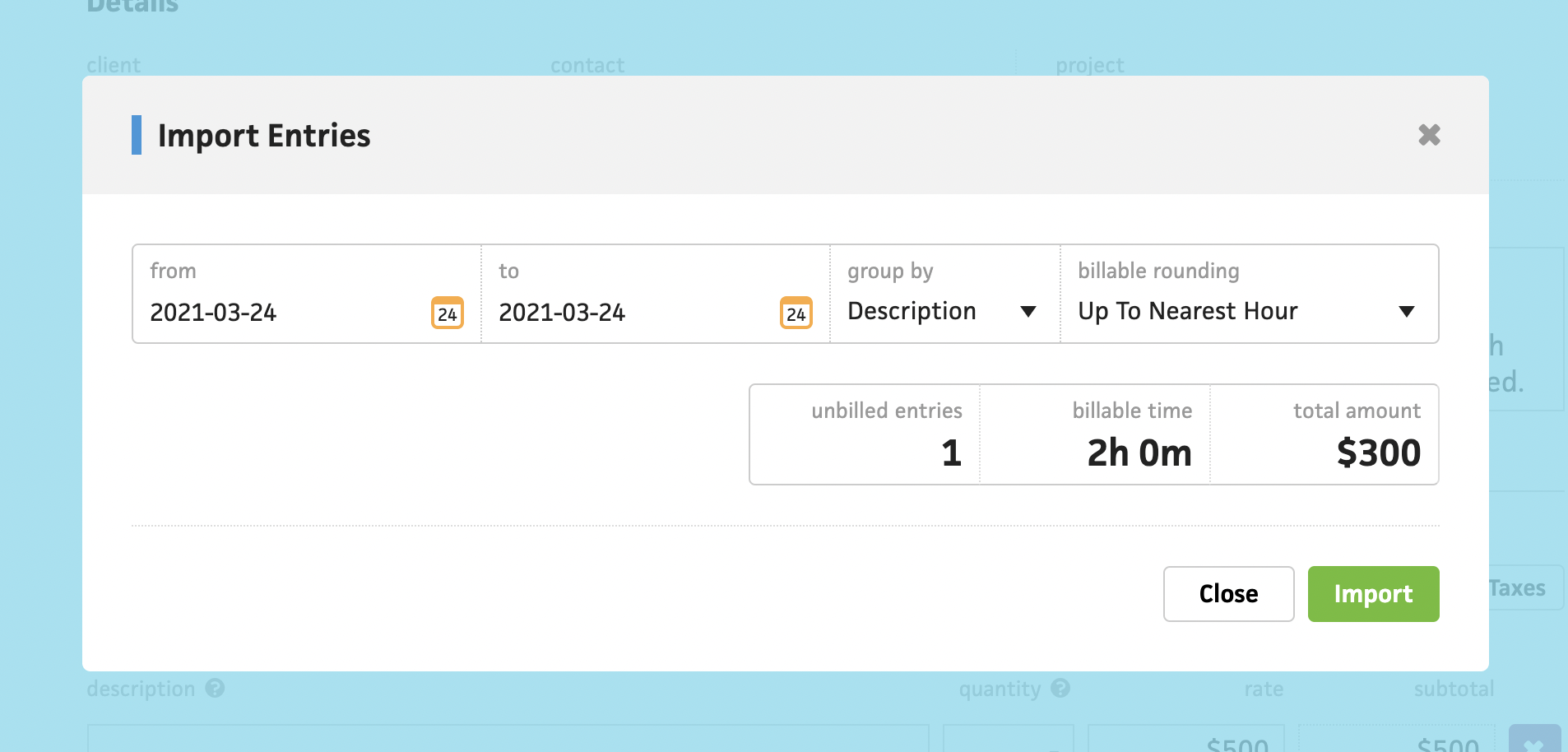
Like a lot of Cushion’s sore spots, importing tracked time is decent as-is. Clicking the import button opens a modal that auto-selects the date range of your unbilled entries. You can then group by description, date, or project, and specify your billable rounding, like rounding up to the nearest 30 minutes, etc. The UI tallies the entry count, total duration, and total amount that would be imported into your invoice. Clicking the submit button then groups these entries and converts them to line items.
This is a fine flow for a v1, and I accept that, but whenever I see this specific flow, I have tunnel vision for all the obvious areas to improve. For example, there’s no insight into how the entry descriptions will appear as line items, nor a way to edit the hard-coded template. You only see the end result once you’ve actually imported the entries, and if you imported a ton of entries that need editing, you’ll need to manually update the line items. If I were to include a field to customize the template for line item descriptions, that alone would be a massive upgrade.
The other big gripe on my list is that you have no idea which entries will be imported until you actually import them. The obvious solution here is to show a list that previews the line items as they would appear in the invoice, including their calculated durations and subtotals. There’s actually a support question I receive somewhat often that could easily be solved by offering a preview.
When switching between import settings for grouping and rounding, sometimes the total amount differs. This occurs because if you have two entries for 15 minutes with no grouping, and you round up to the nearest half-hour, that would total a full hour. However, if you group them together, then round up to the nearest half-hour, you only have a half-hour. This is obvious when you can see a preview that changes in realtime, but it’s suspicious when you can’t see what’s happening under the hood. Simply previewing the line items will instantly squash this common support ticket and give users more confidence when preparing an import.
When I set out to redesign this flow, I didn’t intend to include all the improvements from the start, but then I shared a sneak peek with a user, and they immediately pointed out how helpful a template field would be, so I altered my approach. Instead of matching the existing functionality, I would take an extra week or so to design the flow as it should be. I can do this because I’m no longer under any pressure with Cushion. I can afford to take the time to get it right. This approach feels healthier.
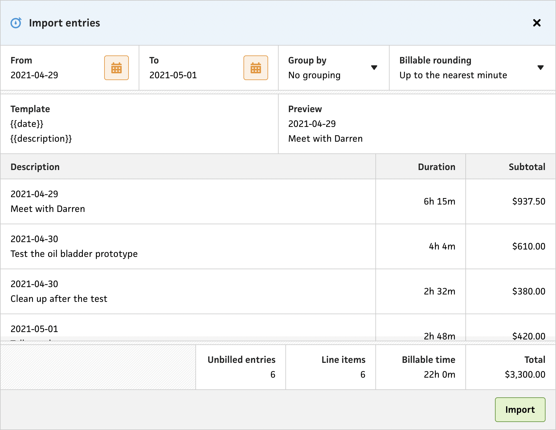
The new form is definitely more robust, but I hope that doesn’t make it feel more overwhelming. I spun my wheels for a bit trying to figure out the best layout for the fields. Grouping the date filter and adjustment dropdowns, template and preview, then listing the line items felt like it followed the grain—especially as the form reflows down to mobile. The form is also scrollable, and the line item headers are sticky, so you can still see the columns once you’re below the fold. I also stuck the totals footer to the bottom, so they’re always visible.
Once again, I made use of the new system’s “stacked” modal, which slides in from the right and dims the background, so users can focus on the import. I also made the import button a single click, compared to the old invoice form, which strangely requires users to click a mysterious “entries” dropdown, which only has a single option, “import”. I must’ve had more ambitious plans for that menu, but I can’t imagine what else I’d throw in there.
Now that this is all built, the only remaining to-do on my list is to insert the line items into the invoice. This shouldn’t take long at all, but I didn’t want to delay this post any longer by waiting until I was 100% finished with the import flow. Truth be told, I’m thrilled with how this all turned out. The UX is so much stronger and no longer leaves the user guessing. I definitely plan to carry this approach throughout the rest of Cushion—show the user everything they should know. At the same time, I need to keep the UI clean, so that will be the real challenge—say a lot with a little.