Journal
Little details: Overflow shadows
In Cushion’s new design system, like in most of my work, the overall look is flat—very flat. I attribute this to learning design under the direction of a creative director with an architecture degree and a senior designer who banned the use of drop shadows at the studio. The combination of these folks shaped me into a designer who is OCD about pixel-perfection, subtlety, and flat design—with an emphasis on sans-serif fonts and the color white. While I still rarely use drop shadows in my own work, I do see the value in using shadows when it helps the UX—in this case, when there’s more content below the fold.
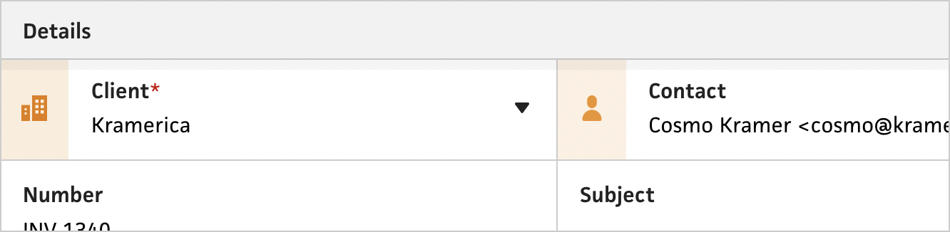
When I started designing the new system, I knew I’d need to introduce shadows because of the various depths within the interface. I primarily thought of using shadows for sidebars and inline forms, but then I realized that they might come in handy for scrollable content and sticky headers. I went ahead and added the shadows to sticky headers, but immediately noticed that they encroach on the elements right below the header. For an input field with 12px top padding, the 8px shadow effectively reduces it to 4px. I do enjoy the shadows and their ability to promote depth in the flat UI, but I know I can’t live with the overlap if it impedes on the interactive elements.
To achieve the best of both worlds, I added scroll-based logic to the shadows. Now, they only appear when there’s overflow content. For sticky headers, if the header is “stuck”, but not overlapping its content yet, Cushion doesn’t show its shadow. As soon as the user starts scrolling into the content, the header’s shadow appears.
I also had a similar situation with form footers, where the shadow would encroach on the elements above it. With the new overflow logic, these footer shadows only appear when there’s more content below the fold. When the user reaches the end of the form, the shadow disappears to mark the end of the form.
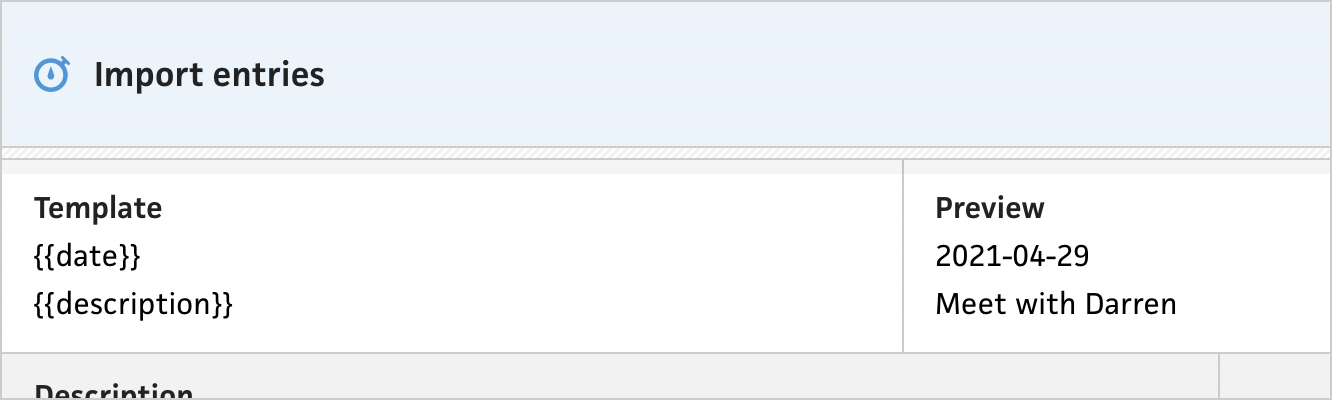
I could’ve stopped there, but then I realized that the divider in the import entries form prevents the sticky header shadows from appearing because those sticky headers don’t apply to the template and preview fields—the divider acts as the header for those fields. Because of this, I decided to apply the same sticky behavior and shadow logic to the divider, so there’s still a shadow to indicate overflow content.
Unfortunately, the divider’s diagonal lines looked awkward when stuck to the top, so I added one final touch. When the divider is stuck, along with the shadow, I also transition the divider background to be a solid fill to match the sticky headers. It’s perhaps the most subtle UI effect I’ve ever built, but I think it makes enough of a difference to keep.
I live for these tiny details. Not everyone notices them, but those who do often appreciate them as much as I do. Whether or not users end up seeing the little touches, I believe they go a long way in making the entire app feel whole and cared for.