Journal
One step back, two steps forward
Last week, I was gearing up to launch a few improvements to the project actions feature that I recently deployed to Cushion. Something didn’t feel right, though—I wasn’t excited about what I was building, which is rare for my personal work, but actually a clue for something more serious. As the week went on, I thought about feedback I received from beta users about the timeline. Folks were having trouble finding certain projects—especially after changing their dates, which would scroll to the project and take the user out of their previous position. At first, I wondered if I could maintain the scroll position but indicate the project has moved, or emphasize the project even more after editing, like highlighting it somehow, but then I came to a full stop and thought, “Is this even the right direction?”—and by “this” I meant the entire layout.
I knew immediately that the answer was no. It’s a tough pill to swallow when you put a ton of work into a certain direction before realizing you need to backtrack and change course, but it’s much easier than finding out later, when users are too invested, or when it’s too late to change without completely redoing. Luckily, this is a beta and I’m the only stakeholder. Making a considerable change right now is probably the best time to do it, so I should at least consider myself lucky that I caught this when I did.
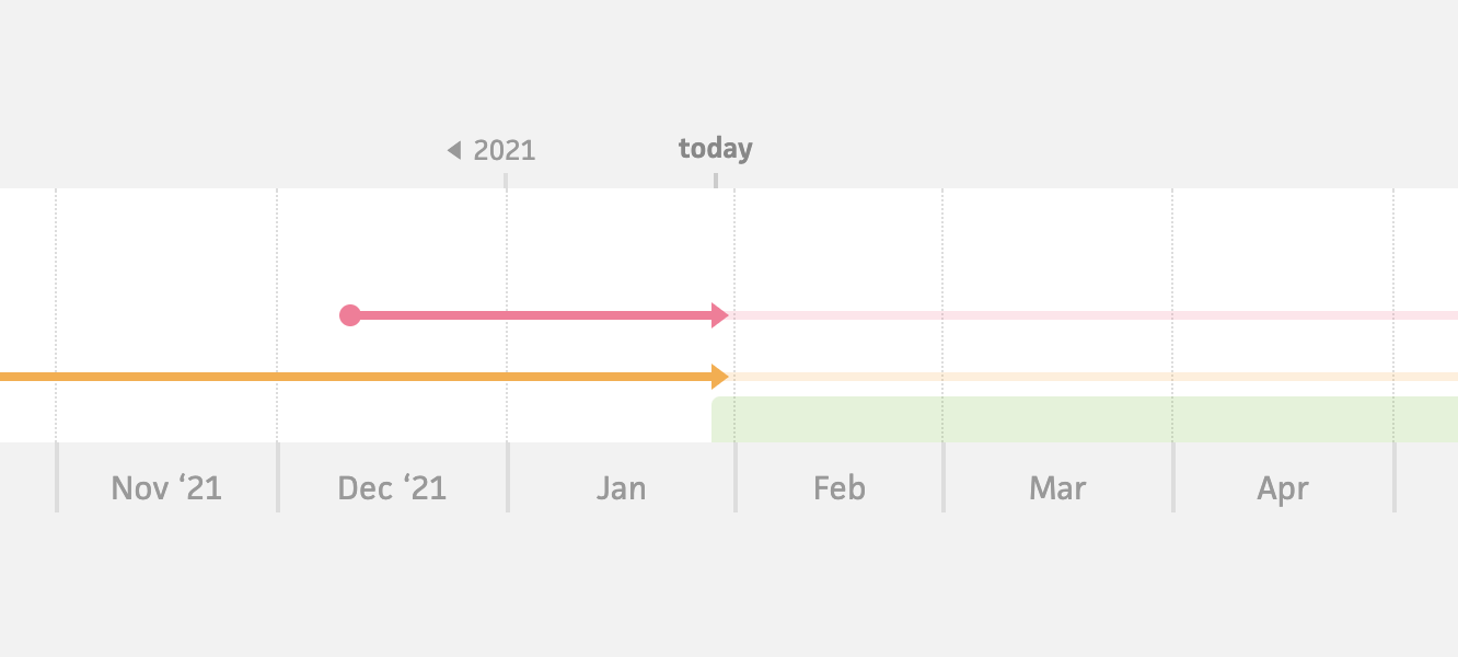
Existing schedule timeline (2014–2021)
The main issue is that the “stacking” timeline layout doesn’t work well—for both the user experience and the dev experience. This is the same layout that I use in the existing schedule timeline, where projects are placed on the timeline where they fit. If a project overlaps another project, it moves down a row, so it does fit. This layout is totally fine if you don’t have many projects, but as soon as you have a reasonable number for any full-time freelancer, it becomes unwieldy. I should’ve taken the hint from all the users who tell me they wish their schedule looked as clean as the one on the homepage. If I were to show a realistic timeline, I think most folks would be overwhelmed.
So if I’m not going with a stacking layout, what’s an alternative that fixes the issues I’m hitting? Taking the “keep it simple, stupid” approach, if folks are having trouble finding projects, I could arrange them in a layout that people are used to, like a list. Then, I could position the timeline adjacent to that list, giving each project its own row. At first, I worried that this would take up too much vertical space versus laying out projects where they fit, and that is true. At the same time, I’d argue that the vertical space is well worth the ease of finding a project in a list, not to mention all the additional benefits of this layout.
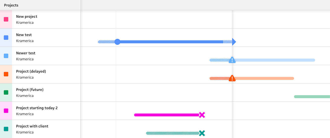
New list-based timeline
As soon as I started designing for this direction, I realized how much potential it unlocked—or rather, how much easier it’ll make future features that have been weighing on me. In the new timeline, I want folks to be able to interact with projects like they would in a list. Now that I have a list, I could simply include a context menu with a popover of actions. Also in the new timeline, I’m determined to let folks interact with scheduling workloads inline, like they would in the planning view. With each project owning an entire row of the timeline, this is entirely possible by toggling the row into some sort of edit mode. Lastly, many users have asked for the ability to prioritize certain projects by putting them at the top, and now this is super easy to implement by letting folks drag & drop the project in the list.
All of the details are still only in my head, but this is what’s getting me excited, and that makes me think it’s the right path. I also feel a sense of relief (and pride, if I’m honest) about taking the time to step back and rethink my approach, knowing that it would be a significant burden to undo this past month’s work. If I’m comparing my personal development between now and when I started Cushion, I can definitely see a maturity upgrade with regards to handling these tough truths. Me from 8 years ago would’ve either disregarded the signs and pushed forward or become disheartened and switched to another feature altogether. I’m not pushing forward or giving up so soon. I’m actually making great progress already!