Journal
Improving the sidebar nav
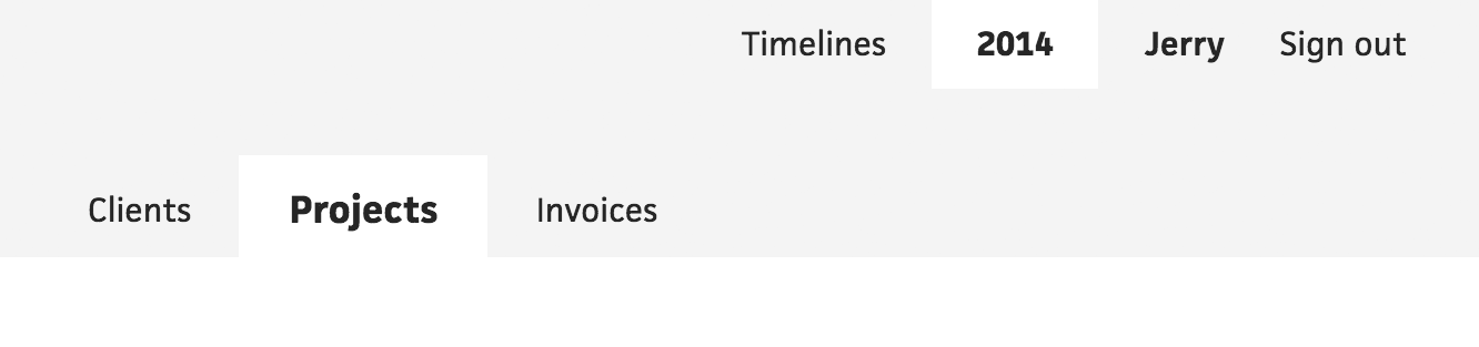
In the early days, Cushion’s nav lived horizontally at the top of the app. Back then, there were only a few sections, so all Cushion needed was a few tabs. Since then, Cushion’s feature set has crept to a point where horizontal tabs simply won’t fit. For a solo dev looking to keep my app to a manageable scale for one person, this would’ve been a “smell”, or clue, that Cushion’s complexity was exceeding that scale. At the time, I did want Cushion to grow exponentially, so I looked at all the startups accomplishing that growth and saw that they all used the skinny sidebar with icons.

I noticed this trend years before I made the switch, with evidence of a 2016 tweet. While I definitely think sidebars can work if they’re clear enough, when I redesigned Cushion’s nav, I opted for the skinny shelf of obscure icons.
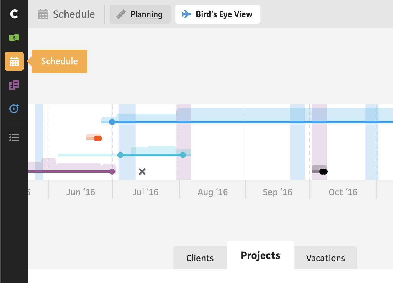
This not only lacked clarity around what the icons represented (unless you hovered the icons or built the app), but it also forced me to house the inevitable secondary navigation elsewhere. For those subsection tabs, I chose horizontally on the top again, which made sense at the time, but created a disconnect between the top level nav and the secondary nav. Then there’s the 3rd set of tabs—let’s not even talk about those.
I’ve lived with this skinny sidebar for a while now, always thinking about how I’d iterate away from it, but knowing that changing the nav would be a substantial undertaking—especially for an app that’s already in the process of migrating frameworks, from Angular to Vue-in-Angular to Vue. Now that my migration approach involves slowly replacing sections with a Vue-only codebase, changing the nav essentially means doubling the work: create the new nav in the new codebase while mirroring the new nav in the old codebase. It’s an uphill battle, but after spending some time designing what the nav could be, I’m ready for it.
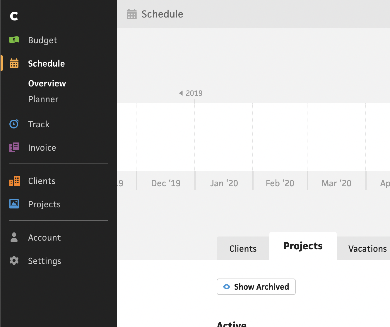
The sidebar nav’s final form
I started by designing the nav how I wanted to see it in the end—when the migration is complete. To make this change doable, I decided to stick with the sidebar nav, but instead of the skinny stack of icons, I expanded it with labels, to create more clarity. At a glance, without any interaction, a user could look at the nav and see what every item means. Then, once they click into a section, the secondary nav appears nested below that nav item. Both the section and the subsection are highlighted, so the user can clearly see where they are.
The sidebar nav using the existing sections
I’m happy with this approach as a gradual progression away from the skinny sidebar, but because this needs to be gradual, I first need to migrate the existing nav and sections to this wider design. While I do have plans for entirely new sections, like “Clients” and “Projects” on the top-level, they aren’t built yet, so I can’t include them. Until they’re finished, I need to design around what Cushion currently has, which is a tough pill to swallow, but it does still leave some room for improvement.
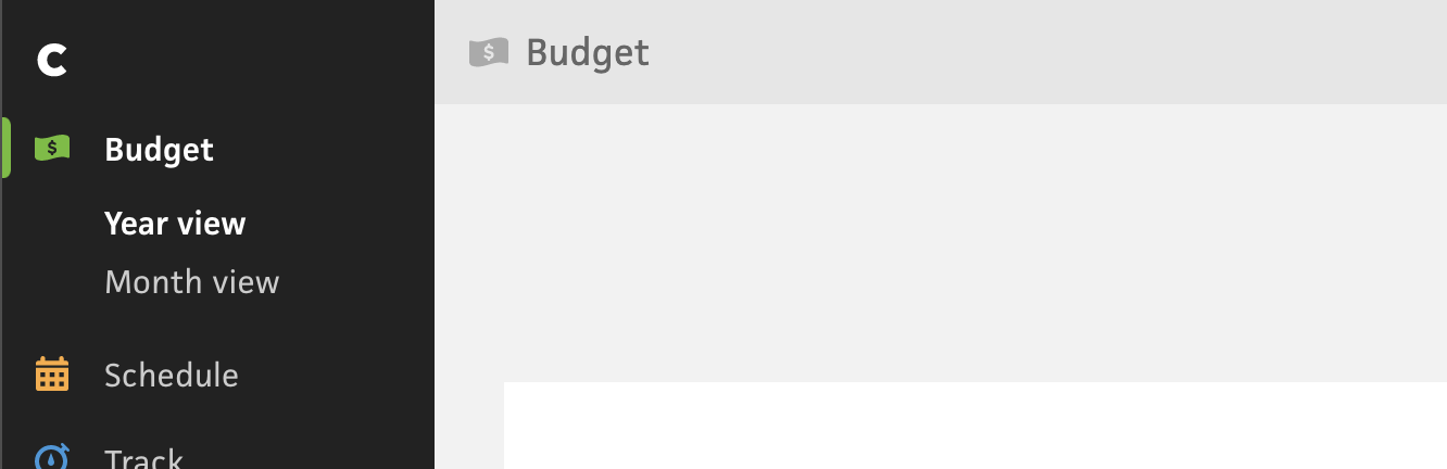
As for improvements, I’m taking this opportunity to smooth out any rough spots that have appeared over the years. A big one is the budget views, which let you view your income in a year view or month view. These views live within a single section, confusingly named “Forecast”, but can only be toggled with a “Switch to Month View” button that blends into the top right. I honestly wouldn’t be surprised if most new users never discovered this part of the app because of how clunky the UX is.

Before
After
To fix it, I’m hoisting these views to the sidebar as secondary nav items, so the “Budget” section consists of “Year view” and “Month view”. As soon as a user clicks into the “Budget” section, they’ll notice that these views exists, and they can easily toggle between them.
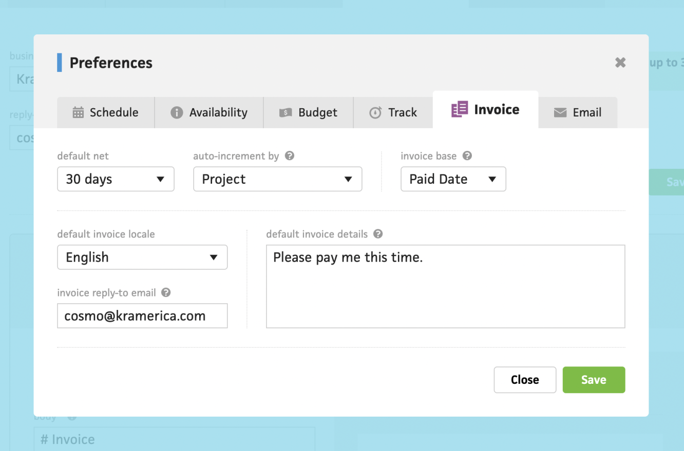
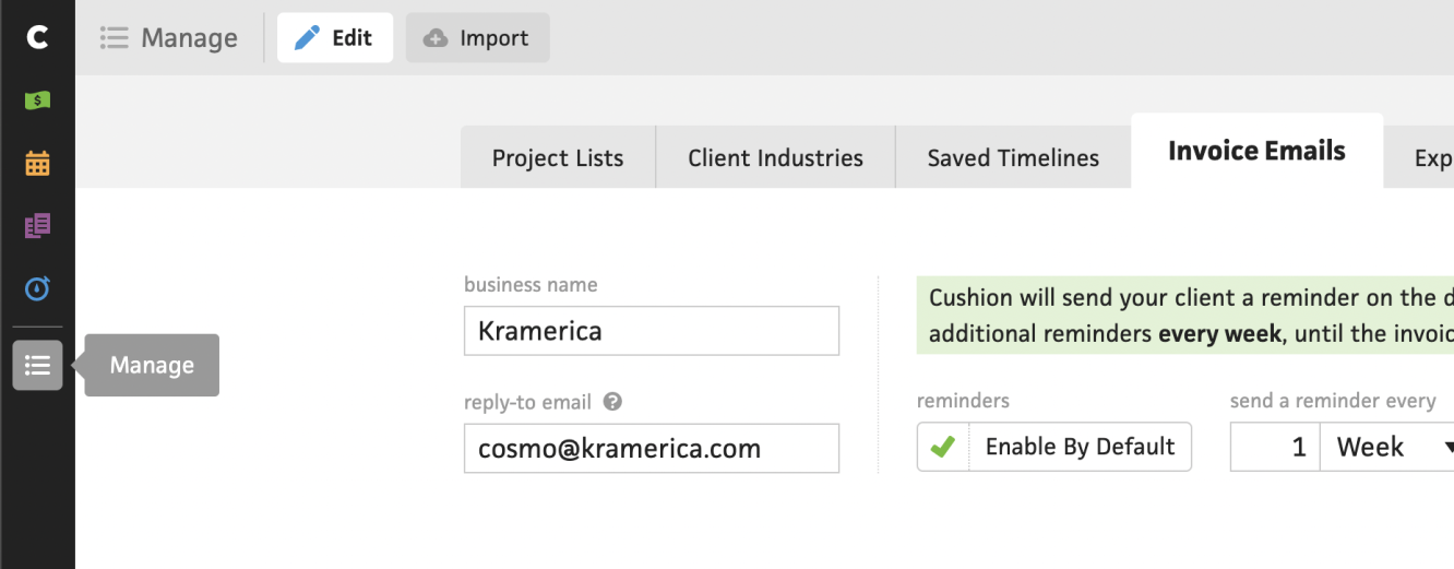
The next improvement on my list requires multiple steps. The end goal is to move the settings for the main features closer to the features themselves. For example, the “Invoice” section has a tab in the “Preferences” modal, but it also has a “Template” modal buried in the invoice preview. On top of that, there’s also an “Invoice Emails” section buried deep in the ambiguously generic “Manage” section. It’s a mess.
To fix it all, I’m planning to include a “Settings” subsection for each of the main features. This helps keep the settings closer to the feature, and in doing so, makes the app more modular. For instance, if I ever wanted to offer the ability to only have invoicing, I could easily do that by simply hiding the other main features from the sidebar—the invoice settings would cover everything configurable about invoicing.
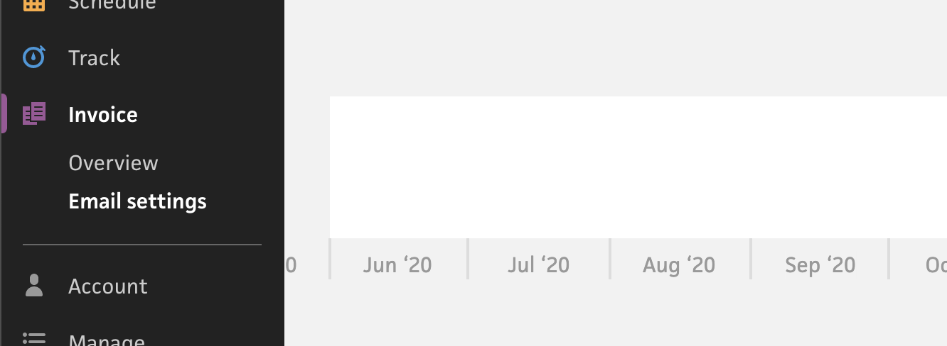
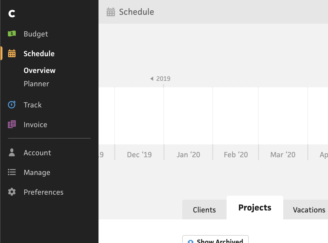
That subsection “Settings” plan is the end goal, but because this needs to be done in multiple steps, I’m first going to move the “Invoice Emails” section from the “Manage” section to the “Invoice” section, as “Email settings”. This should be clear enough to hold everyone over until the full migration is complete.
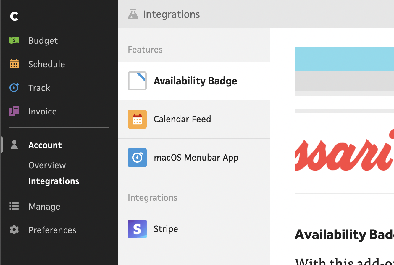
The next big change is renaming “Add-ons” to “Integrations” and moving it under the “Account” section. Some might suggest that this lives on the top-level, but because it’s more of a set-up-and-go section, I don’t think it needs that level of visibility. I’m still banging my head about originally naming it “Add-ons” and hiding it in the bottom left corner. I’ve realized that the bottom left corner is a blindspot for most users, so many of them don’t even notice that the section is down there, let alone the “Account” section! Because of this, I’m promoting the “Account” section with its “Integrations” subsection to the main list in the top left.
By making this move, I actually open up that bottom left corner, which is still useable—even more so with a wider sidebar—and a prime location for relevant items that are totally fine being a blindspot most of the time. For one, I’ve always had an issue with the chat button always hovering over the bottom right corner, and preventing certain UI layouts, so I’m moving it to the bottom left. Along with chat support, I’m going to have a proper link to the support guides straight from the sidebar nav. This should help a ton of self-serve users who simply want to read documentation. Lastly, I’m including a “What’s new” link that points to the Cushion blog. As of the recent blog redesign, it now includes the changelog and journal posts, so it’s the place to go for Cushion updates, but most users don’t go there because it’s not linked. Time to fix that.
This post has already gone on longer than I expected, so I’ll stop there, but let me tell you, I’m excited. I think (and hope!) these changes will make a big difference to Cushion’s UX, and finally tackle the rough patches that I’ve been staring at all these years. It’ll also breathe some new air into the existing app, while I continue my work on the new revamped sections of Cushion. If you have any thoughts, suggestions, or concerns, I’d love to hear them!