Journal
Handling timeline labels

A top priority in Cushion’s new schedule timeline is label visibility, or in clearer terms, always showing labels. This comes from a recent revelation that it might be easier for users to identify projects if their labels are always visible instead of forcing them to hover a project to identify it (ya think!?) After designing a worthwhile solution, I fell in love with the new approach and started implementing it. I quickly realized, however, that it’s full of edge cases.
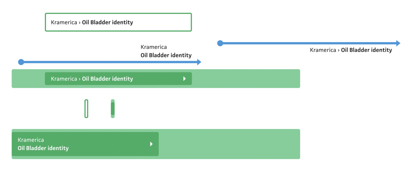
When I initially started designing the new schedule timeline, I considered a handful of ideas for the labels. Because it’s a dealbreaker for them to always be visible, the design revolved around a solution for this. Do I put the labels inside the project or outside the project? When a label is longer than its project is wide, do I crop the label, show it on hover, or both?
In the end, I decided to place labels below the projects, with enough spacing between rows to keep it comfortable. Since a future iteration of the timeline includes visuals sitting above the projects, the bottom remains a safe spot. Keeping the labels outside of the projects also lets me maintain a familiar visual to the existing schedule timeline using dots and lines. Still, I need to handle the edge cases.
The most noticeable issue is handling labels that exceed the width of the project. To get around this, I considered including the label width in the project width when laying out the projects in rows, so nothing overlaps, but I didn’t think this would look right visually. I needed a solution that could scale from single-day projects to multi-year projects. It didn’t take long before I landed on cropping. Now that the timeline is larger, I have more room to work with, but I also have bigger shapes to work with, too. For example, because the new timeline dots (used for dates) are 24px in diameter (instead of 10px), projects are guaranteed a minimum width of 24px. Even if I crop a label down to 24px, that’s a decent amount of room to hint at the project, but I can’t just do a hard cut.
To soften the cropped edge, I feather it with a gradient. Technically, this means cropping to the width of the project using a clip path, but drawing a linear gradient rectangle on the right when the project width is less than the label width. I could use a proper SVG mask for a more by-the-books approach, but SVG masks have always given me performance issues, so I automatically avoid them. The schedule timeline could potentially have dozens, or even hundreds, of projects, so I need to be careful about performance.
While a cropped label is an okay solution, it bends the rules of an “always-visible” label. I can’t solely rely on folks only seeing 24px of a label, so I still need to show the full label on hover. The main problem here is that if I’m not factoring the label width when laying out all the projects, a single-day project could be close enough to another project that their labels overlap on hover, making them unreadable.
The most obvious solution was to fade the labels. At first, I tried fading all of them when hovering a single label, but that was overkill and visually jarring. To dial it down a bit, I tried fading only the overlapping label. Luckily, I realized it’s easy to detect overlapping labels simply by comparing their bounding rectangles. If the hovered label’s left and right straddle the adjacent label’s left or right, I know they’re overlapping. After coding it up, it looked great, and I felt like I dodged a bullet on a potentially hairy situation.
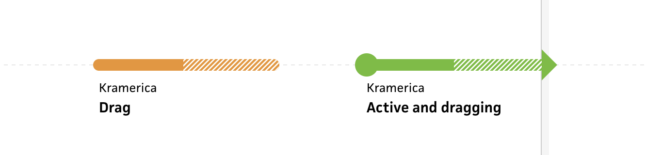
The last edge-case that I needed to handle was labels for long projects that go off the screen. If all labels are left-aligned, and I scroll the timeline so the beginning of a long project is off the screen, its label will be off the screen as well. Fortunately for me, the solution for this was an obvious one—sticky labels. As the label scrolls off the screen, I simply clamp its position between the left edge of the screen and the right edge of the project. In SVG land, it’s not as easy as position: sticky;, but it’s still pretty easy, using the min/max trick: x = Math.max(canvasLeftEdge, Math.min(projectRightEdge, x)). The end result is pretty mesmerizing as all the labels stick to the edge as you scroll.
It’s funny to think that something as simple as labeling can still be so complex and full of edge cases. At the same time, it’s a nice challenge, and I’m happy with where I ended up. I really feel like I’m on the right path with this timeline design.