Journal
Animating the new homepage hero
I’ve had a rough couple of weeks, but I’m trying really hard to get through it. One thing that helps is keeping my mind busy with Cushion. I recently launched the new homepage that is somewhat of a regression to a previous design, but pointed in the right direction for the product. I kept it incredibly to-the-point, with an intro, a few feature callouts, a grid of testimonials, and a signup footer. To me, this serves as a solid “clean slate” to move forward with.
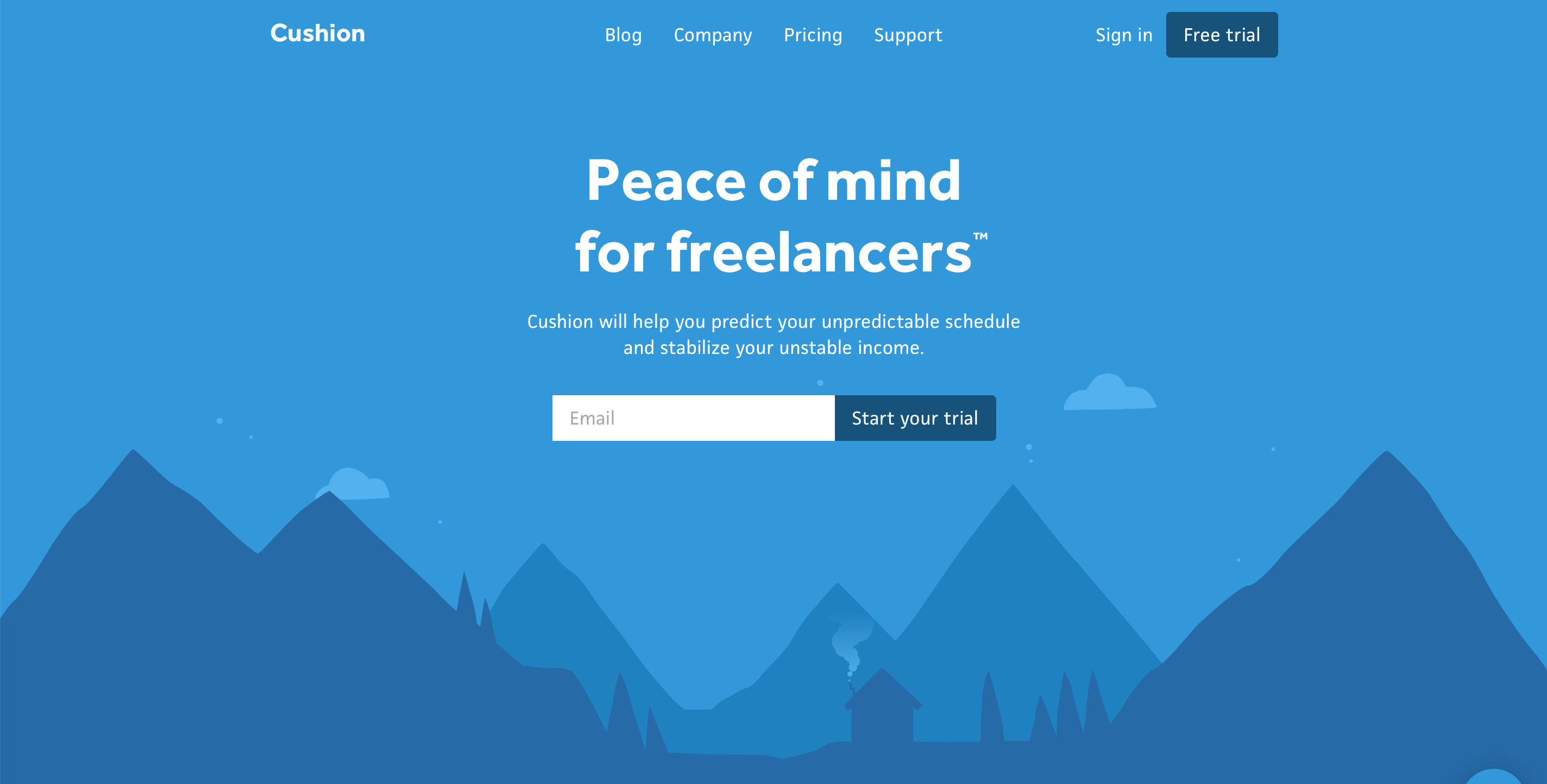
While most of the page is no frills, I felt determined to do something I’ve always wanted to do—animate the landscape. This idea has lived in the back of my mind since Laura Bohill delivered the illustrations a few years ago, but it was never a priority. After working at Stripe for the past year and a half, however, there’s a new part of me that refuses to launch something until it’s at the quality bar that it was meant to launch at. For the landscape illustration, this means subtly moving the clouds, parallax for the mountains, and animating smoke from the cabin.
The clouds were no big deal because this animation currently exists in Cushion’s onboarding. The SVG itself is duplicated horizontally and shifted on a 400-second linear loop. I ended up launching with the clouds appearing behind the mountains, but I did play around with an idea of having them appear in front of the mountains in the back. While it did look really cool, it was too much once I included the cabin smoke as well.
The parallax was also no big deal because I accomplished this on the homepage of my personal site. The difference this time around is that I included the hero text in the parallax movement, too. As you scroll, it feels like it floats in front of the foremost mountains, which—I got to be honest—makes me weak in the knees. The best part of the parallax is when the form shifts over the clouds passing behind it. I just love how this makes the illustration go from 2D to “2.5D”.
I save the best for last with animating the cabin smoke. While I always wanted to do this, I never had a strong idea for the approach. There are so many ways to emulate smoke with code, but we’re dealing with the web, so it needs to be performant. Fortunately, my first attempt of generating the smoke particles ended up looking perfect for the illustration.
Every second, I generate a new particle, and I move its y-position up at a tenth of the speed (frame / 10). Then, I lean on my Flash math skills from 2001 and move the particle horizontally using cosine with a radius of the particle’s relative frame divided by 50 (“relative frame” meaning the frame number starting at zero when the particle is generated). For the scale of the particle, I base it on the relative frame divided by 8 seconds. Once the particle reaches a scale of 1, I remove it and reuse it for the next new particle.
It took a bunch of tweaking to get the smoke to look right, so there are plenty of versions I should’ve recorded where the smoke goes as wide as the window or scales way too big. Probably the trickiest part was fading the smoke out at the top. At first, I tried changing each particle’s opacity on a linear scale, like the y-position, but it didn’t look natural. Compared to not fading at all, it looked great, but Jen pointed it out when I showed her, so I knew I could do better. Instead of controlling the fade on the individual particles, I decided to fade the entire trail of smoke by using a linear-gradient in a mask-image. This smoothly “faded” the smoke without making it blatantly obvious that it’s made up of circles.
The smoke animation is great, but as soon as I scrolled, I witnessed the parallax of the smoke overlap the mountains in the back, which was just *chef’s kiss*. I love the way these animations make me feel, and I know that going the extra mile for something insignificant doesn’t seem worth the time, but the more I work on Cushion, the more I consider it to be an art piece I’m working on versus a business I’m building.