Journal
Addressing beta feedback for the new Clients section
I recently started rolling out the new Clients section in Cushion, but as a private beta, so I could get feedback from longtime users. This is an approach that I used all the time with the original launch of Cushion, but at some point, I decided to just release new features to everyone. I think that was the wrong move because as much as I’d like everyone to have all the features, iterating is easier when the users know things are bound to change and can provide you with consistent feedback. When releasing early features to every user, you run the risk of new users getting a bad impression because the features are unfinished or unpolished, or you get feedback from the wrong users, like tire-kickers. That’s why I’m returning to private betas with trusted users before launching big features.
I’ve only invited a few dozen folks to the beta, but I’ve already started to receive incredibly valuable feedback (keep it coming!). Whereas I would typically jot down the feedback for later, while continuing to work on the remaining features on my list, I’m determined to address feedback quickly, so I can continue polishing the new Clients section into a ready-to-release feature. It feels like a healthy process—spend a week working on a feature, release it, spend a week addressing feedback, repeat. I’m trying really hard to break my old habit of moving forward too fast, focused on new features and my own assumptions. Now that I’m asking for feedback on early features, I can address the feedback as I go instead of getting too far with a feature before showing it to anyone—this last bit is an unfortunate theme of Cushion’s less intuitive features.

As for specific feedback for the Clients section, the main concern revolved around the feel and appearance. With Cushion’s new design system, I’m generous with padding and spacing, specifically for form fields where I’ll often include the label along with the input. When introducing a table with rows, I applied that same sizing despite not having labels, so the result was a 72px tall row for 14px text—like a single person in a kingsize bed. Since table rows are new to the design system, I was all ears for this feedback and easily fixed the spaced-out feeling by reducing the row height by half, which feels proportionate to the text within it.

Another concern involved the vertical borders between columns. This, again, was carried over from the design system’s form fields, where fields are essentially blocks with borders that I can stack like LEGOs in a form. With table rows, however, the quantity of rows and the repeated vertical lines take away any sense of breathing room. The horizontal lines suffice as far as keeping everything visually organized, so I reworked the table cell component to not include borders.
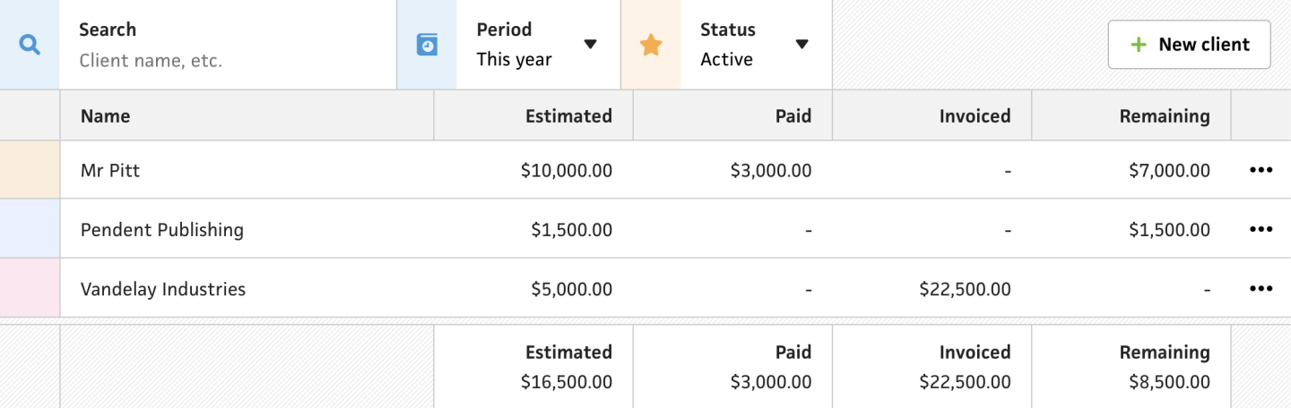
The end result feels so much better than it did before. The proportion of the row height to the text seems right, and the absence of the vertical lines definitely opens up to the UI to provide the breathing room it needs. I’m thrilled with how this turned out, and love that this feedback came from users, because now I can tell them that they personally had a role in shaping Cushion—one of the best parts of working on the app. As a user of apps myself, it’s pretty rare that feedback ends up being addressed in a reasonable amount of time, if at all. That’s why I love going out of my way to respond to users and apply their suggestions. It makes a user no longer feel like just a user, and it makes me feel like I have a personal connection to the people who find value in what I’m building.