Journal
A slimmer schedule timeline
This past month, I’ve been traveling a whole lot, which explains the gap in journal posts. I did have a few pockets of time to work on Cushion, but not enough solid progress to justify a new post. Now that I’m back and settled, it’s time to go full speed ahead again.
The main focus as of late is the scheduling side of the app. I’m bummed that I spent the majority of this time focusing on budgeting when scheduling is the more day-to-day view. If I went with scheduling first, I probably would’ve been able to ship a beta prior to adding budgeting. Oh well.

Leading up to this post, the scheduling timeline consisted of thick bars labeled with the project name. With ideal data, this looked fine, but as soon as I plugged in my real freelancing data, I could tell this wouldn’t work. At one point I was working on five websites at once because of delayed start dates and delayed deadlines. As you could imagine, these thick bars stacked five-high took up half the screen and were difficult to read at a glance. With the real data, I went back to designing and came up with a thinner, more legible look.

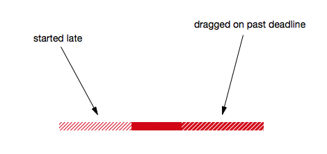
Aside from the thickness change, I also had to completely rethink the indicator of delay (project starting late) and drag (project finishing late). In the first design, both were signified with the same look—a lighter fill of the project color. This looked fine if a project started late or dragged on too long, but if it did both, the bar became very confusing.

I decided to use hatching, instead of transparency, to fix the problem. Since a delay means you’re not working on a project yet, a lighter hatching would make the delayed piece of the bar feel slightly removed from the solid, but still a part of it. With drag meaning you’re actively working on the project past its deadline, a heavier hatching would made it feel closer to the solid—the time in which you’re actively working within the estimated dates.
With this new design in place, the scheduling timeline is now legible at a glance, even using my real data. It’s been so helpful in preparation of my return to client work, telling me everything I need to know about the upcoming months and assuring me that I have a handle on future projects.